A Simple Infographic Can Catch Any Reader's Attention
- Alison Cuevas

- Nov 9, 2015
- 2 min read
As a journalist, my two main concerns about using data are the loss of reader interest and the backlash I could get if I report something incorrectly.One of my main concerns with using data in journalism is that readers don’t want to read about numbers. To address this, I would try to keep the reader’s interest by highlighting data that is relevant and avoiding including any unnecessary information that could bog down the story. I would also try to create a visually appealing inforgraphic to share the data instead of just including numbers in my text.
Another concern I have is that I may get backlash if the data I provide is inaccurate. To ease this fear, I can check the source that provides the data for my story. I can also tripel check that what I type in my story is true to the information that was provided by my source of data.
Data is a really underrated resource because it involves numbers but in reality, it strengthens credibility and builds stronger fact-based story. Infographics are often used to lay out useful data that supports a story. I’ve never seen data be the centerpiece to a story, but it makes a great element to a bigger story.
One of my favorite news sources is the Huffington Post and they have a whole part of their site dedicated to infographics. The last story I read was about lead poisoning in America. The writer, Alissa Scheller starts the story with an emotionally appealing introduction to a boy named Freddie Gray who died of spinal injuries in Baltimore, MD.

CNN also recently used data in a story about the wage gap between men and women. This graphic is very fun and easy to read which I really appreciate as someone who is interested in the topic but doesn't want to spend hours flipping through data about the wage gap.

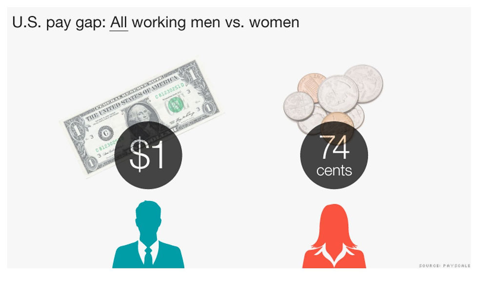
Both infographics provide useful information to support their stories without being overwhelming to the reader.


Comments